01: The Brief
Penfield Fire Company required a cohesive visual identity that could bridge the gap between their storied tradition and a modern, digital-first community. I was brought on to overhaul their visual presence across every major touchpoint - from the logo on their equipment to the apparel worn by the crew, and the digital interfaces where they engage with the public.
Key Objective: To create a unified, professional brand ecosystem that enhances recruitment efforts and streamlines public communication through consistent high-end design.
02: The Challenge
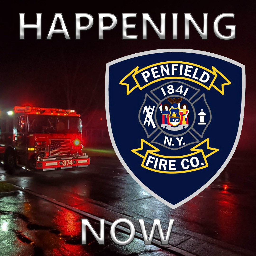
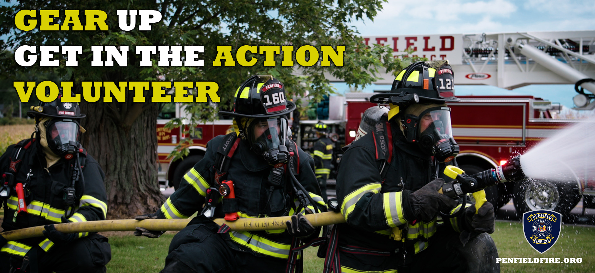
Fire companies operate in a high-stakes environment where visual authority matters. Penfield faced the challenge of fragmented branding: their social media didn't match their web presence, and their apparel lacked a modern, "streetwear-utility" appeal.
- The Scope: Developing a scalable system that works as effectively on a 16px favicon as it does on a large-scale vehicle wrap.
- The Goal: To position Penfield Fire as a premiere, professional agency that attracts top-tier volunteers and commands respect in the community.
03: The Process
I approached this project by treating the Fire Company as a modern corporate entity with a "community-first" heart.
- Logo Refinement & Creation: I developed a modernized mark that retains the heraldry of the fire service while introducing geometric precision. The new logo was designed with "versatility first," ensuring it remains legible in embroidery, vinyl, and digital screens.
- Digital Infrastructure (Web & Social): I redesigned their web interface for speed and clarity, specifically focusing on the volunteer application funnel. For social media, I developed a library of "Action Templates" for real-time incident reporting and community education.
- Multi-Format Content Production: I synchronized on-site photography with graphic design to create a consistent "grid aesthetic" on Instagram, making the department’s daily operations look as cinematic as their emergency responses.
04: The Solution
A 360-degree brand transformation that solidified Penfield Fire Company's status as a modern leader in public safety.
- Unified Visual Language: Every asset—from the website header to the patch on a firefighter's sleeve—now speaks the same professional dialect.
- Strategic Web Design: The new web layout prioritized UX, making critical information (fire safety, recruitment, and contact) accessible in two clicks or less.
- High-Engagement Social Suites: The introduction of stylized, high-contrast social content led to increased community following and a significant uptick in recruitment inquiries.
05: The Impact
- Recruitment Growth: A cleaner, more professional "look and feel" directly contributed to a more robust pipeline of volunteer applicants.
- Community Perception: The department is now viewed as a modern, transparent, and tech-savvy organization, increasing trust during public fundraising and safety campaigns.
- Future-Proofing: By providing a comprehensive set of brand guidelines and templates, the Penfield Fire Company is equipped to maintain its professional image for years to come without further external design intervention.