01: The Brief
Bristol Valley Theater is a cultural pillar, but their visual presence needed to reflect the high-caliber, professional equity performances they bring to the region. I was tasked with a complete visual overhaul—from a new logo that honors their heritage to an immersive program book and a high-impact spring series campaign.
Key Objective: Create a sophisticated, unified brand language that appeals to long-time patrons while attracting a younger, modern audience.
02: The Challenge
The theater’s existing assets felt fragmented. The "Spring Series" needed a unique energy each year, but the core BVT brand was getting lost in the shuffle. I had to design a system where the master brand (the logo) remained constant while the promotional materials (spring series) could adapt to the specific "vibe" of the season’s lineup.
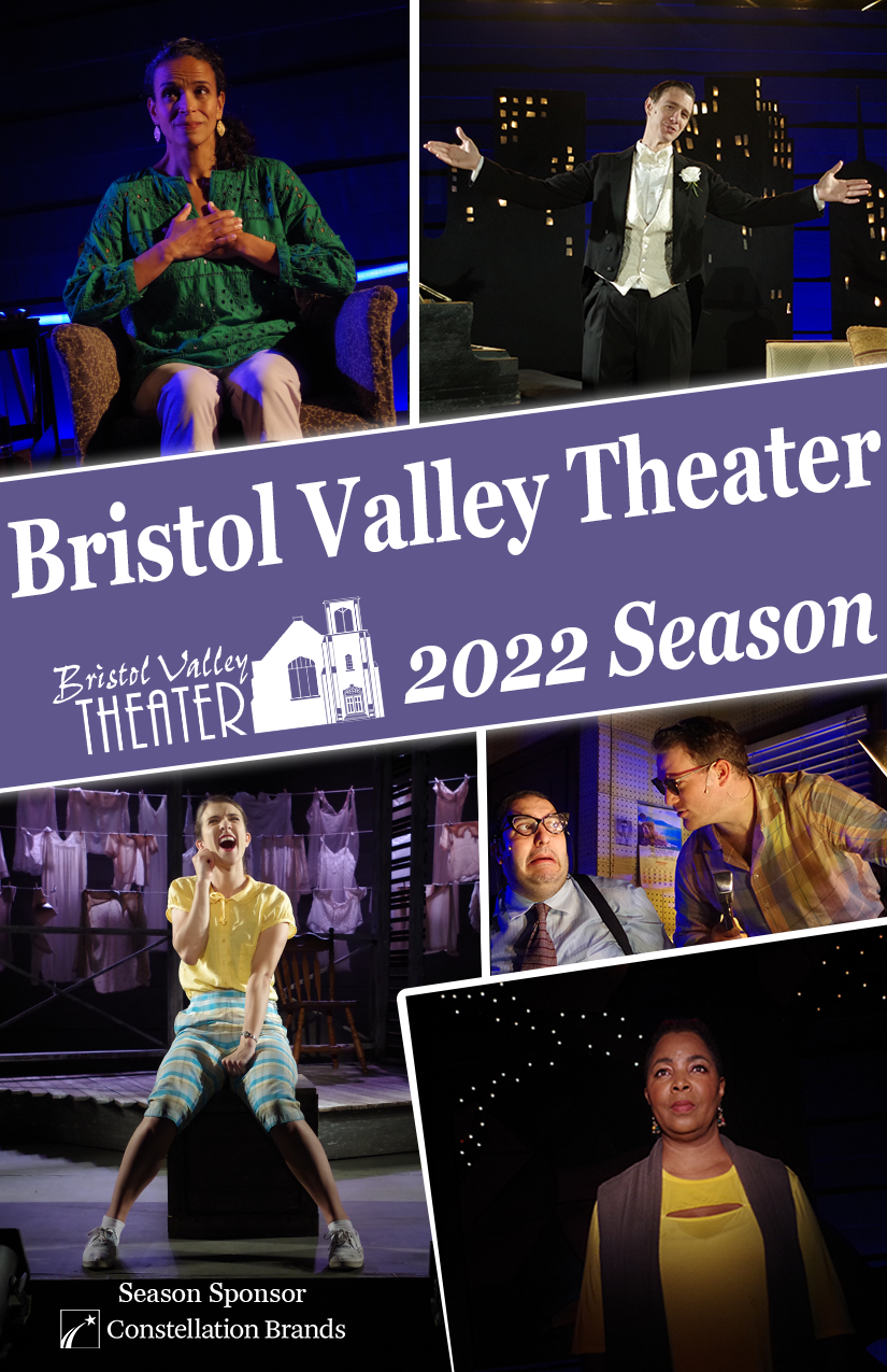
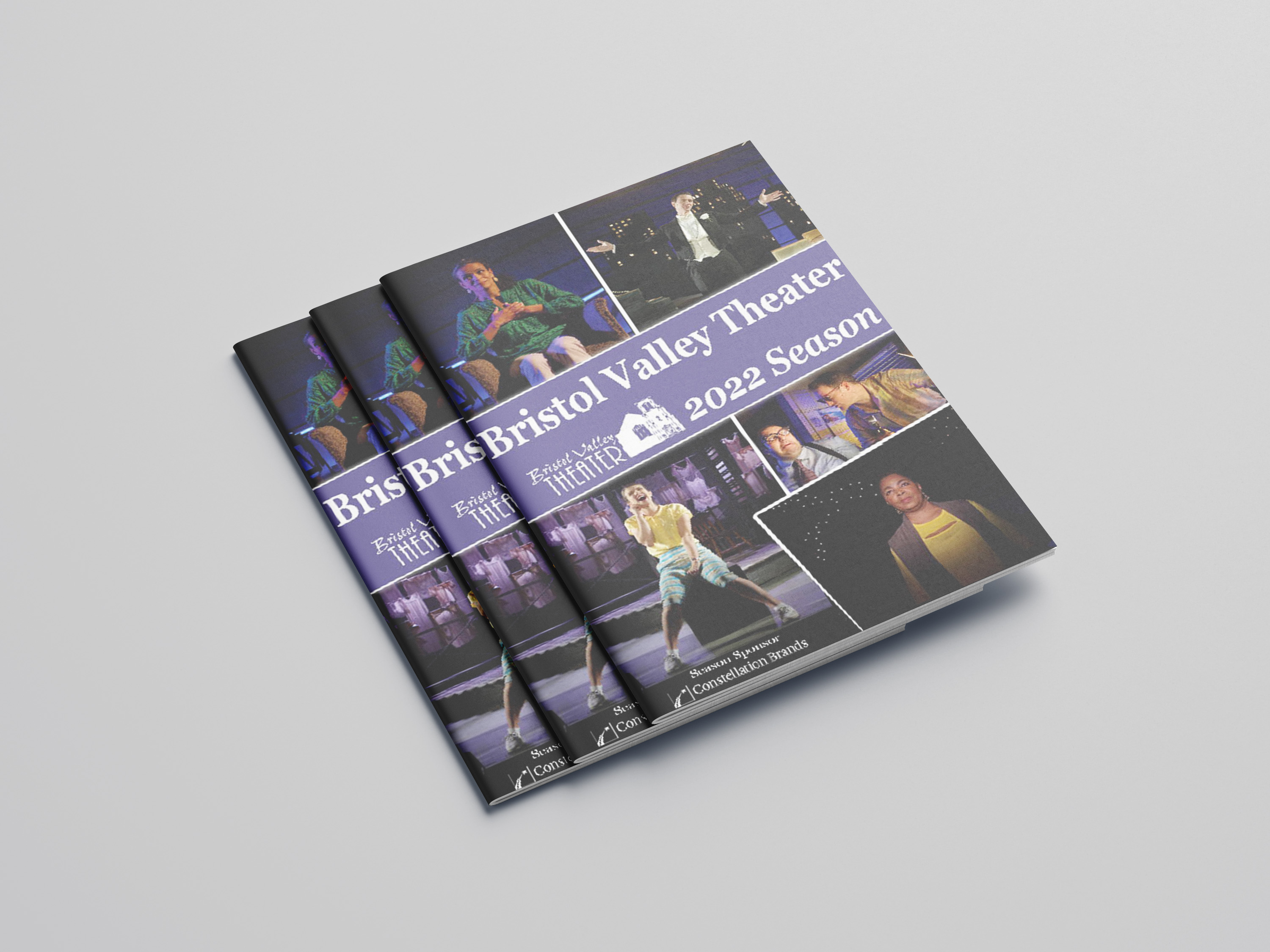
- Reimagined Logo, 40-page Seasonal Program Book, and Multi-channel Social Promotions.
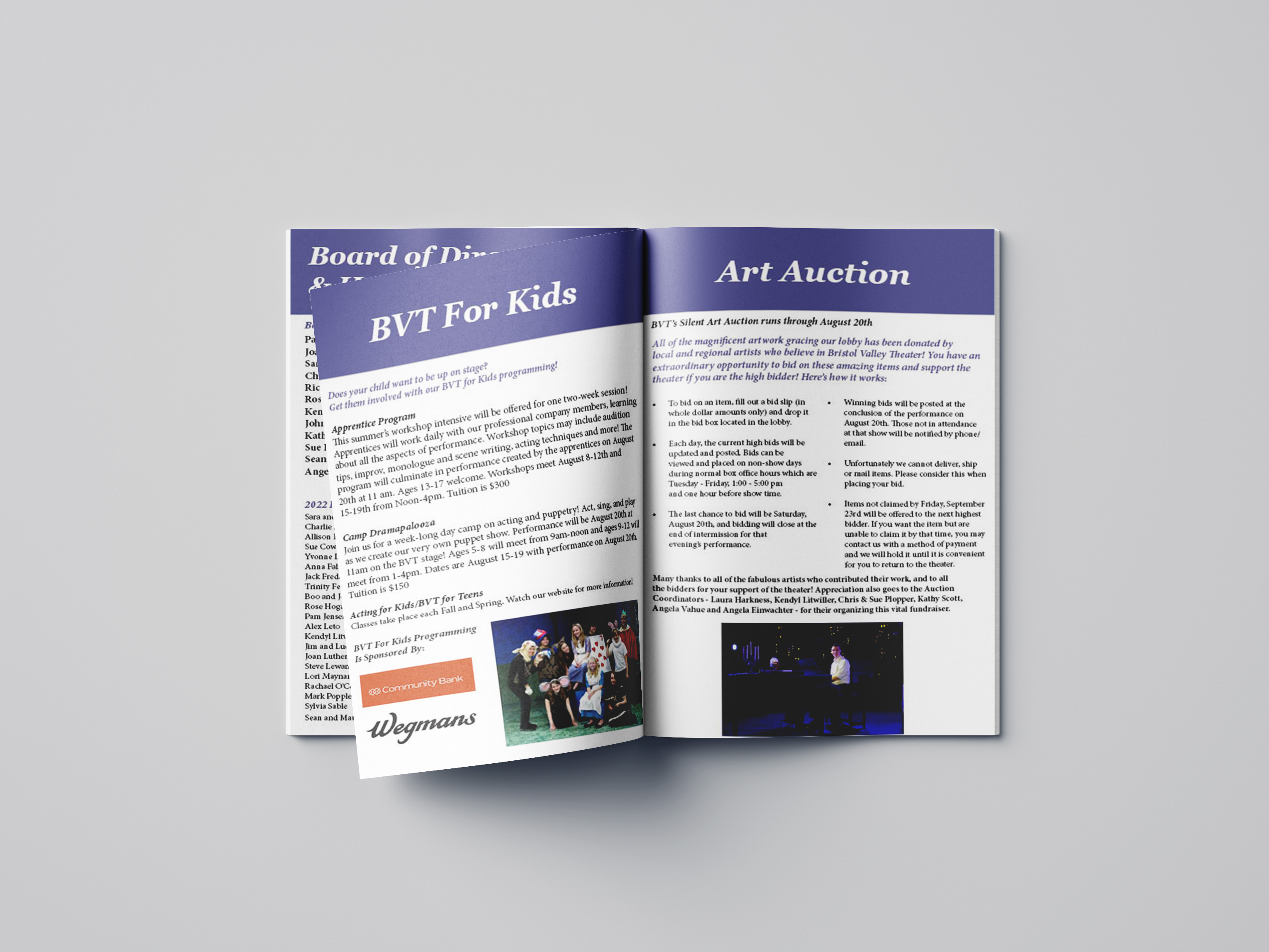
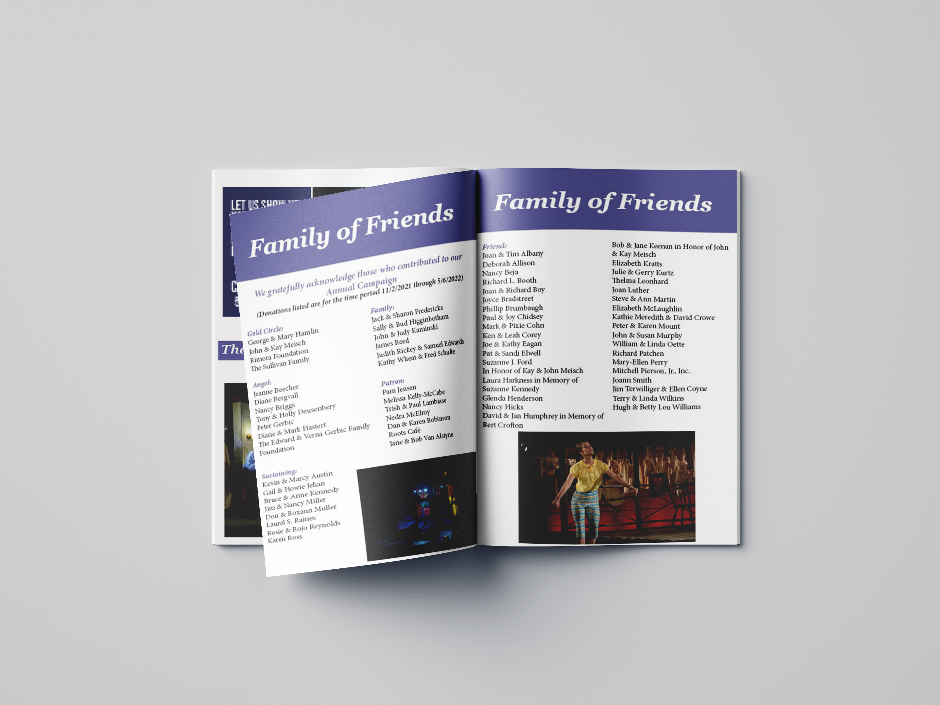
- The program book had to hold a massive amount of donor and cast data without looking like a dry directory.
03: The Process
I approached BVT as a "Living Gallery."
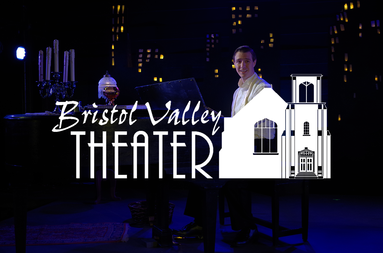
- Logo Evolution: I developed a logo that utilizes clean, architectural lines - hinting at the theater's physical space - while maintaining a classic, timeless weight.
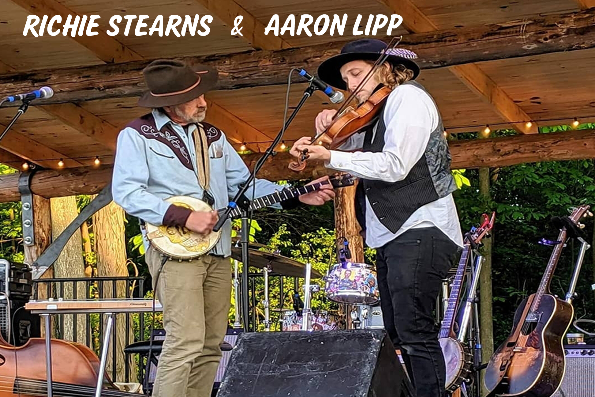
- Editorial Layout: For the Program Book, I moved away from standard grids. I treated each play in the series as a "feature story," using high-contrast photography and dramatic white space to mirror the spotlight of a stage.
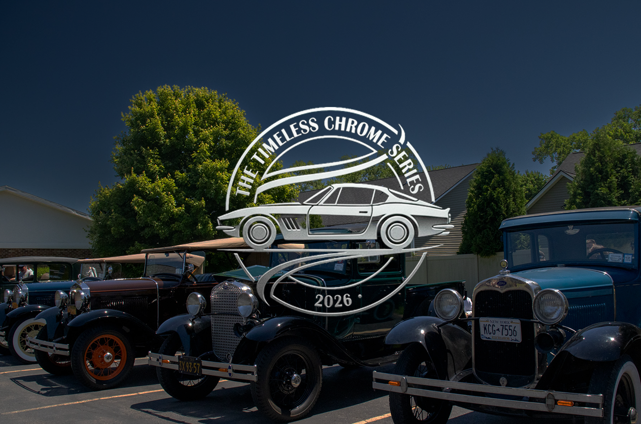
- The Spring Campaign: I developed a "Color-Story" for the spring promotions. Each show was assigned a distinct, vibrant palette that worked within the master brand, making the social media feed look like a curated art exhibition.
04: The Solution
A cohesive, "Design-First" theater experience.
- The Logo: Versatile enough for a tiny social media avatar or a massive stage-side banner.
- The Program Book: Transformed from a "throwaway" flyer into a coffee-table style keepsakes that patrons actually took home.
- Spring Promotions: A suite of kinetic social ads and posters that utilized bold typography to make the show titles the star of the show.
05: The Impact
- Visual Synergy: For the first time, BVT’s print and digital presence were 100% aligned, creating an immediate "premium" feel.
- Patron Response: Significant increase in program book retention and positive feedback on the modern, readable layout.
- Digital Growth: A marked uptick in ticket-click-throughs from the new, high-energy Spring Series social assets.