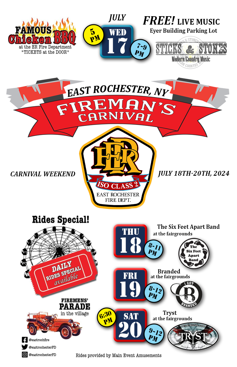
01: The Brief
How do you modernize a 100-year-old tradition? The East Rochester Fire Department needed a campaign that honored their legacy while capturing the high-octane energy of a three-day music festival and carnival.
Key Objective: Create a multi-channel poster series that drove physical attendance while looking "social-first" for digital promotion.
02: The Challenge
The previous years used standard, information-heavy flyers that got lost in the noise. The ERFD needed a visual "north star"—a design that felt as loud as the live bands and as bright as the carnival lights, all while maintaining the authoritative "Fire Department" branding.
- Target Audience: Local families, music fans, and the greater Rochester community.
- The Constraint: Incorporating massive amounts of text (dates, band lineups, sponsors) without sacrificing visual impact.
03: The Process
I approached this using a "Vintage-Future" aesthetic.
- The Anchor: I used a bold, high-contrast serif typeface for the "ERFD" branding, reminiscent of classic fire truck gold-leaf lettering, but paired it with neon "carnival-light" glow effects.
- Visual Hierarchy: To manage the large lineup, I utilized a modular bento-style layout for the posters. This allowed the eye to jump from the "Main Event" to the "Band Schedule" without feeling overwhelmed.
- Modular Layouts: I built a template system that allowed us to swap out band names and daily schedules without breaking the brand’s visual grid, allowing for rapid updates as the festival lineup evolved.
04: The Solution
A vibrant, cohesive series of three primary posters and ten digital "shout-out" assets.
- A Unified Visual Voice: By harmonizing classic "Fire Department" motifs with modern music festival aesthetics, I ensured the ERFD maintained its professional heritage while appealing to a younger, digital-native audience.
- Social Engagement: The high-contrast graphics led to an increase in "shares" on the ERFD Facebook page, becoming the most-engaged promotional cycle in the department's history.
- Physical Presence: The print ads were distributed across the Greater Rochester area, creating a professional, "big-city festival" feel for a local village event.
05: The Impact
- Cultural Momentum: The poster series became a "souvenir" item, with community members requesting extra copies for their homes.
- Brand Perception: Successfully shifted the event's image from a "local fundraiser" to a "must-attend music festival."
- Civic Pride: The project reinforced the ERFD brand as a professional, modern organization that invests in the quality of its community outreach.